Back To Top Block #
The Back To Top Block provides users with a convenient, floating button that allows them to quickly scroll back to the top of the page with a single click. This feature enhances site usability, especially on pages with long content, by offering easy navigation and a smoother browsing experience.
Back To Top Block Options:

- Icon Settings:
- Choose Icon: Select from multiple arrow or chevron designs for the back-to-top icon, such as:
- Corner Right Up
- Arrow Up
- Corner Left Up
- Arrow Big Up
- Arrow Up From Line
- Square Arrow Up
- Circle Chevron Up
- Icon Size: Define the size of the icon for better visibility.
- Stroke Width: Adjust the thickness of the icon’s lines for a sharper or softer look.
- Icon Color: Set the color of the icon to ensure it complements your site design.
- Choose Icon: Select from multiple arrow or chevron designs for the back-to-top icon, such as:
- Spacing Settings: Control the button’s size and placement with spacing options:
- Border Color: Customize the color of the button’s border.
- Border Size: Set the width of the button’s border for a minimal or bold outline.
- Border Radius Size: Define the roundness of the button’s corners for a sharp or circular design.
- Padding: Adjust the spacing within the button to optimize its proportions.
Frontend View of Back To Top Block

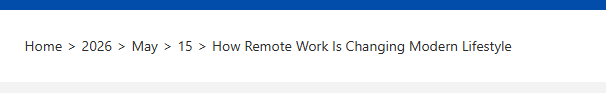
Breadcrumb Block #
The Breadcrumb Block is a navigational aid that displays a breadcrumb trail, showing users their current location within the site’s hierarchy. This feature helps improve user experience by making it easier to navigate between pages and understand the site’s structure.
Breadcrumb Block Options:
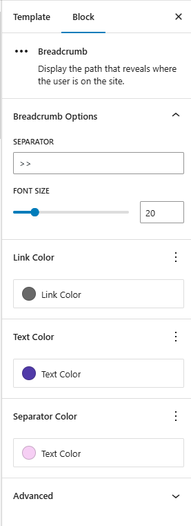
- Separator: Choose the character or symbol used to separate breadcrumb links. Examples:
>,/,|, or custom icons. - Font Size: Customize the font size of the breadcrumb text to ensure readability and consistency with the site design.
- Link Color: Define the color of breadcrumb links (clickable items) to distinguish them from static text.
- Text Color: Set the color of non-link text (e.g., current page name) for clarity and aesthetics.
- Separator Color: Customize the color of the separator symbol to complement the breadcrumb text.
Frontend View of the Breadcrumb Block:
Breaking News Block #
The Breaking News Block is designed to display important posts or announcements in a highlighted, attention-grabbing format. It is ideal for showcasing news, updates, or special announcements that need to stand out on the website. This block helps ensure that critical content is clearly visible to users and improves overall content discoverability.
Breaking News Block Options:
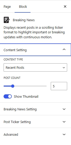
- Content Settings:
- Content Type: Choose the source of posts to display in the block:
- Recent Posts: Show the latest posts.
- Post Ids: Specify exact post IDs to display only certain posts.
- Category Ids: Filter posts by categories.
- Tags Ids: Filter posts by tags, allowing for more granular content selection.
- Recent Posts: Displays the latest published posts.
- Post IDs: Display specific posts by entering their IDs.
- Category IDs: Filter posts based on selected categories.
- Tag IDs: Filter posts based on selected tags for more precise control.
- Post Count: Define how many posts should be displayed in the block.
- Show Thumbnail: Enable or disable featured images for each post to enhance visual presentation.
- Content Type: Choose the source of posts to display in the block:
- Breaking News Setting:
- Icon: Add or select an icon to visually highlight the Breaking News section.
- Breaking News Background Color: Set the background color for the Breaking News label or section.
- Breaking News Text Color: Customize the text color to improve readability and contrast.
- Breaking News Icon Color: Customize the color of the Breaking News icon to complement the selected background and text colors while maintaining visual consistency.
- Post Ticker Setting:
- Post Ticker Background Color: Choose a background color for the ticker to help it stand out on the page.
- Post Title Color: Set the color for the post titles within the ticker, aligning with your site’s branding or theme.
- Slide Speed: Control the speed at which posts slide across the ticker, adjusting for optimal readability.
- Gap Between First and Last: Define the space between the first and last posts in the ticker, creating a continuous loop effect.
- Pause on Hover: Enable this option to pause the ticker when users hover over it, making it easier to read content.
Frontend View of the Breaking News Block:

Multi Post Block #
The Multi Post Block is a dynamic content display block that allows you to showcase multiple posts, announcements, or updates in a scrolling ticker format. It is designed to keep your visitors engaged by continuously presenting fresh content in a compact and visually active way. Ideal for news sections, alerts, promotions, or blog highlights, this block helps improve content visibility without taking up significant page space.
Multi Post Block Options:
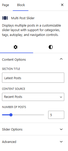
- Content Options:
- Section Title: Choose the title for the block or define the heading for the displayed posts.
- Content Source: Select the type of content to display:
- Recent Posts: Displays the latest published posts in chronological order.
- Posts by Category: Filters and displays posts based on selected categories.
- Posts by Tags: Shows posts filtered according to assigned tags.
- Number of Posts: Define how many posts should be displayed in the block.
- Slider Options
- Slider Type: Choose the scrolling direction of the ticker:
- Horizontal
- Vertical
- Slides Per Page: Set the number of posts visible at one time in the slider.
- Slider Autoplay: Enable or disable automatic sliding of posts.
- Show Slider Arrows: Toggle navigation arrows for manual control.
- Slider Type: Choose the scrolling direction of the ticker:
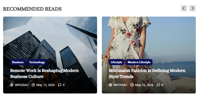
Frontend View of the Multi Post Block:
Post Showcase Block #
The Post Showcase Block is used to display posts in a visually engaging layout. It allows flexible content selection and multiple design styles to present blog posts, news, or custom post types in an attractive grid or layout format.
Post Showcase Block Options:
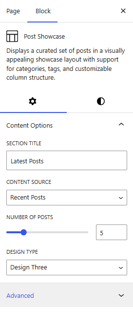
Content Options
- Section Title: Define the title displayed above the Post Showcase block.
- Content Source: Choose where the posts should come from:
- Recent Posts – Displays the latest published posts automatically
- Posts by Category – Filter and display posts from selected categories
- Posts by Tags – Show posts based on selected tags
- Inherit from Templates – Use posts defined in the template settings
- Related Posts – Display posts related to the current post context
- Number of Posts: Set how many posts should be displayed in the showcase.
- Design Options: Select the layout style for displaying posts:
- Design One
- Design Two
- Design Three
- Design Four
- Design Five
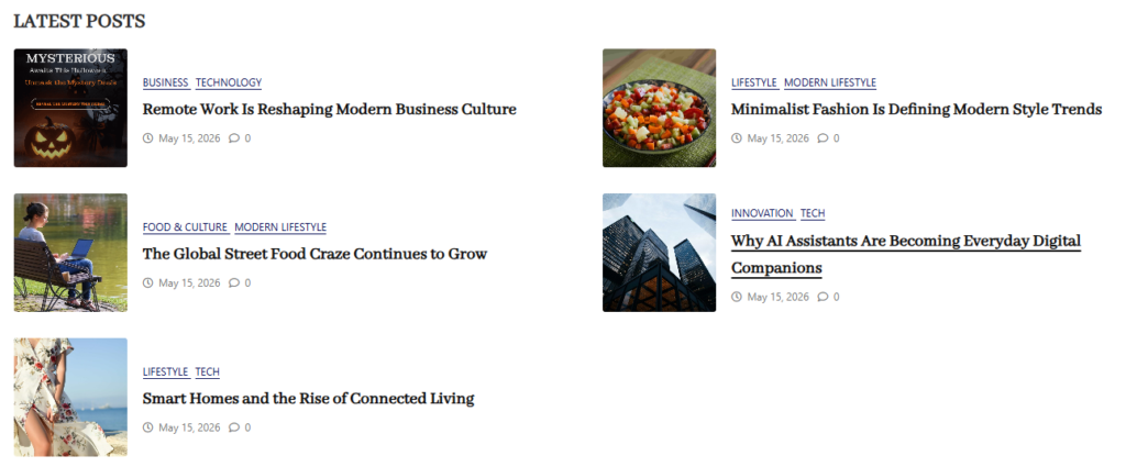
Frontend View of the Post Showcase Block
Post Slider Block #
The Post Slider Block allows you to display posts in a tabbed layout, making it easy for visitors to browse content by categories or tags.
Post Slider Block Options:
- Content Options
- Content Source: Choose where the posts should come from:
- Recent Posts:
- Posts by Category: Filter and display posts from selected categories
- Posts by Tags: Show posts based on selected tags
- Content Source: Choose where the posts should come from:
- Select Categories/Tags: Choose the categories or tags whose posts you want to display in the showcase.
- Number of Posts: Set how many posts should be displayed in the showcase.
- Slider Options:
- Slider Autoplay
- Show slider arrows
Frontend View of the Post Slider Block
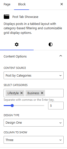
Post Tab Showcase Block #
The Post Tab Showcase Block allows you to display posts in a tabbed layout, making it easy for visitors to browse content by categories or tags.
Post Tab Showcase Block Options:
Content Options
- Content Source: Choose where the posts should come from:
- Posts by Category – Filter and display posts from selected categories
- Posts by Tags – Show posts based on selected tags
- Select Categories/Tags: Choose the categories or tags whose posts you want to display in the showcase.
- Number of Posts: Set how many posts should be displayed in the showcase.
- Design Options: Select the layout style for displaying posts:
- Design One
- Design Two
- Column to Show: Choose the number of columns used to display the posts in the showcase section.
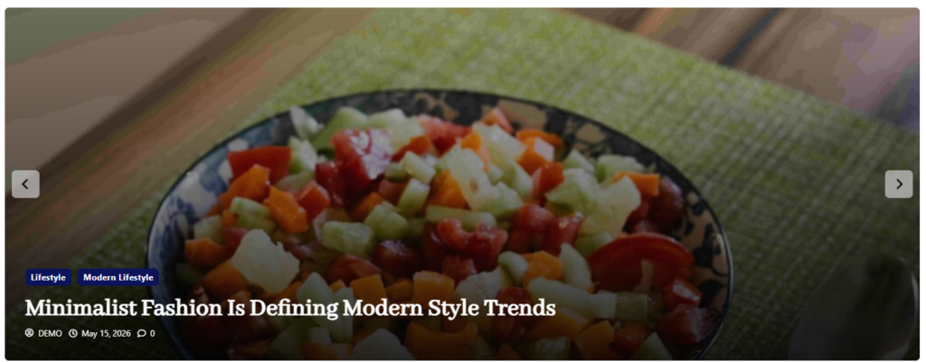
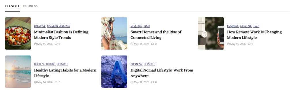
Frontend View of the Post Tab Showcase Block
Search Block #
The Search Block is a content display feature that helps users quickly find and explore posts on your website.
Search Block Options:
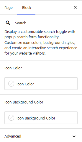
Content Options
- Icon Color: Set the color of the icon used in the tab or block interface to match your site’s design.
- Icon Background Color: Customize the background color behind the icon to improve visibility and visual consistency with your theme.
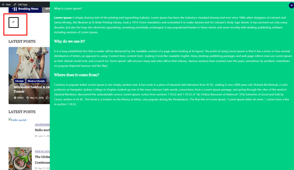
Sidebar Popup Block #
The Sidebar Popup Block allows you to display a collapsible sidebar that can be triggered by a button or icon. It is designed to provide quick access to additional content, navigation, or widgets without cluttering the main page layout. This improves user experience by keeping important information accessible while maintaining a clean design.
Sidebar Popup Block Options:
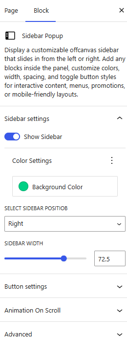
- Sidebar Settings
- Show Sidebar: Enable or disable the sidebar popup functionality.
- Background Color: Set the background color of the sidebar to match your website design.
- Select Sidebar Position: Choose where the sidebar appears on the screen:
- Right
- Left
- Sidebar Width: Adjust the width of the sidebar to control how much screen space it occupies.
- Button Settings
- Font Size: Set the size of the button text or icon.
- Color Setting: Define the text color of the button.
- Icon Color: Customize the color of the button icon.
- Border Color: Set the border color of the button.
- Background Color: Choose the background color of the button.
- Border Size: Adjust the thickness of the button border.
- Border Radius: Control the roundness of the button corners.
- Padding Vertical Size: Set vertical spacing inside the button.
- Padding Horizontal Size: Set horizontal spacing inside the button.
Sidebar Popup Block Block
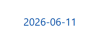
Today’s Date Block #
The Today’s Date Block is a simple yet useful feature that displays the current date or a custom date format on your website. It is especially helpful for blogs, news websites, and event-based platforms where showing date information improves context and relevance.
By adding this block, you can keep your content dynamic and informative without needing manual updates.
Today’s Date Options:
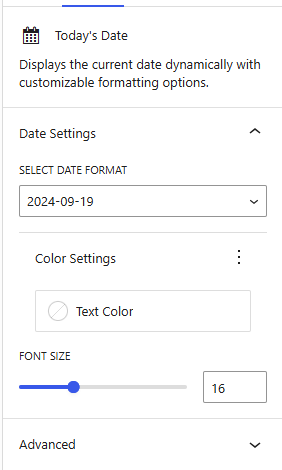
- Select Date Format: Choose from a variety of predefined formats or customize the date format to suit your needs (e.g., “DD/MM/YYYY,” “Month Day, Year”).
- Text Color: Set the color of the date text to align with your website’s design and improve readability.
- Font Size: Adjust the font size to match your layout, ensuring the date is prominent yet cohesive with the surrounding content.
Frontend View of the Today’s Date Block: