Accordion #
The Accordion Block allows you to organize and present information in collapsible sections, providing a clean and user-friendly way to display large amounts of content without overwhelming your visitors. This feature is perfect for FAQs, trip details, or step-by-step guides, enhancing both functionality and aesthetics on your website.
Accordion Options:

- Number of Accordions: Define the number of collapsible sections to be included in the block.
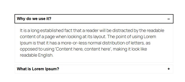
Frontend View of the Accordion Block:
Advanced Gallery #
The Advanced Gallery Block is designed to showcase an image gallery with enhanced customization options, including layout flexibility, lightbox effects, and design control. It is perfect for creating visually appealing image displays on your site, whether for portfolios, travel photos, or featured images.
Advanced Gallery Options:
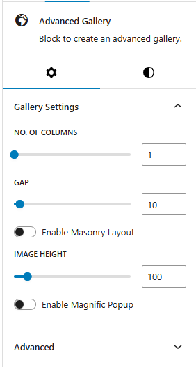
- Gallery Settings:
- Number of Columns: Choose the number of columns to organize images within the gallery. This can range from a single-column to a multi-column layout, providing flexibility based on screen size and aesthetic preference.
- Gap: Define the spacing between images, allowing for tight or spacious layouts according to the design style.
- Enable Masonry Layout: Activate a masonry layout to create a dynamic grid where images are arranged in a staggered pattern, ideal for images of varying heights and sizes.
- Image Height: Set a consistent height for images to ensure uniformity or create a specific visual style within the gallery.
- Enable Magnific Popup: Enable this option to display images in a Magnific Popup lightbox when clicked.
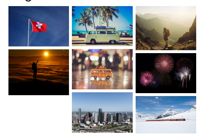
Frontend View of the Post Filter Block:
Back To Top #
The Back To Top Block provides users with a convenient, floating button that allows them to quickly scroll back to the top of the page with a single click. This feature enhances site usability, especially on pages with long content, by offering easy navigation and a smoother browsing experience.
Back To Top Block Options:

- Icon Settings:
- Choose Icon: Select from multiple arrow or chevron designs for the back-to-top icon, such as:
- Corner Right Up
- Arrow Up
- Corner Left Up
- Arrow Big Up
- Arrow Up From Line
- Square Arrow Up
- Circle Chevron Up
- Icon Size: Define the size of the icon for better visibility.
- Stroke Width: Adjust the thickness of the icon’s lines for a sharper or softer look.
- Icon Color: Set the color of the icon to ensure it complements your site design.
- Choose Icon: Select from multiple arrow or chevron designs for the back-to-top icon, such as:
- Spacing Settings: Control the button’s size and placement with spacing options:
- Border Color: Customize the color of the button’s border.
- Border Size: Set the width of the button’s border for a minimal or bold outline.
- Border Radius Size: Define the roundness of the button’s corners for a sharp or circular design.
- Padding: Adjust the spacing within the button to optimize its proportions.
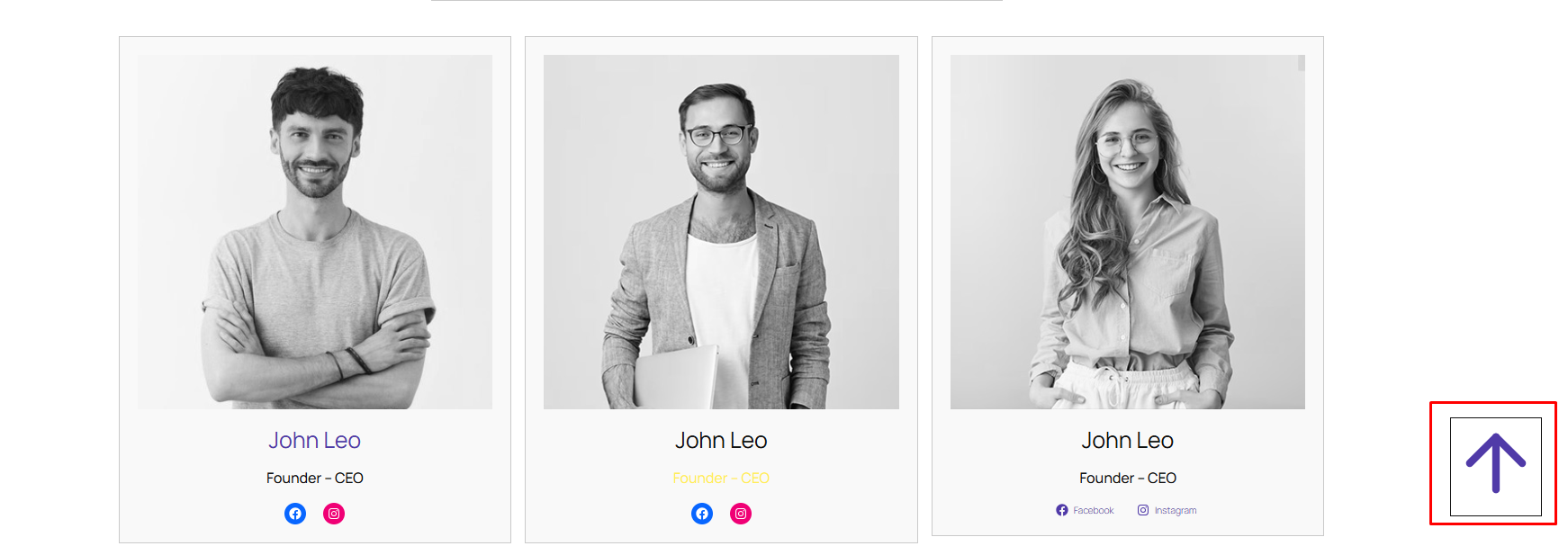
Frontend View of Back To Top Block
Breadcrumb #
The Breadcrumb Block is a navigational aid that displays a breadcrumb trail, showing users their current location within the site’s hierarchy. This feature helps improve user experience by making it easier to navigate between pages and understand the site’s structure.
Breadcrumb Block Options:
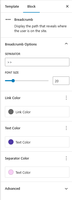
- Separator: Choose the character or symbol used to separate breadcrumb links. Examples:
>,/,|, or custom icons. - Font Size: Customize the font size of the breadcrumb text to ensure readability and consistency with the site design.
- Link Color: Define the color of breadcrumb links (clickable items) to distinguish them from static text.
- Text Color: Set the color of non-link text (e.g., current page name) for clarity and aesthetics.
- Separator Color: Customize the color of the separator symbol to complement the breadcrumb text.
Frontend View of the Breadcrumb Block:

Counter #
The Counter Block is a visually engaging element used to showcase numerical data, such as statistics, milestones, or achievements, in an animated format. It grabs users’ attention and highlights important figures dynamically as they scroll.
Counter Block Options:
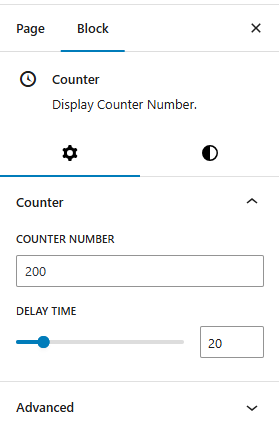
- Counter:
- Counter Number: The final number the counter will display (e.g.,
100,5000). - Delay Time: Define how long (in milliseconds or seconds) the animation takes to reach the target number.
- Counter Number: The final number the counter will display (e.g.,
Frontend View of the Counter Block:

Icon picker #
The Icon Picker block allows you to easily select and apply icons to elements on your site. It is a versatile tool for customizing content and design by offering a variety of icons to represent actions, features, or other elements.
Icon Picker Options:

- Select Icon: This option allows you to define the total number of stars in the rating. Typically, this is set to 5 stars, but you can customize it based on your preferences.
- Link: This option lets you define a URL for the icon to link to. If you wish to make the icon clickable
Frontend View of the Icon Picker Block:

Map #
The Map Block allows you to display geographical locations interactively, providing a clear and engaging way for users to visualize destinations, routes, or landmarks. This block is ideal for travel websites, event pages, or any platform where showcasing a location is essential.
Map Options:

- Enter Location: Specify the location to be displayed on the map, using an address or coordinates.
- Height of Map: Set the height of the map to fit seamlessly with your website’s layout.
- Zoom: Adjust the zoom level to focus on a specific area or provide a broader view.
Frontend View of the Map Block:

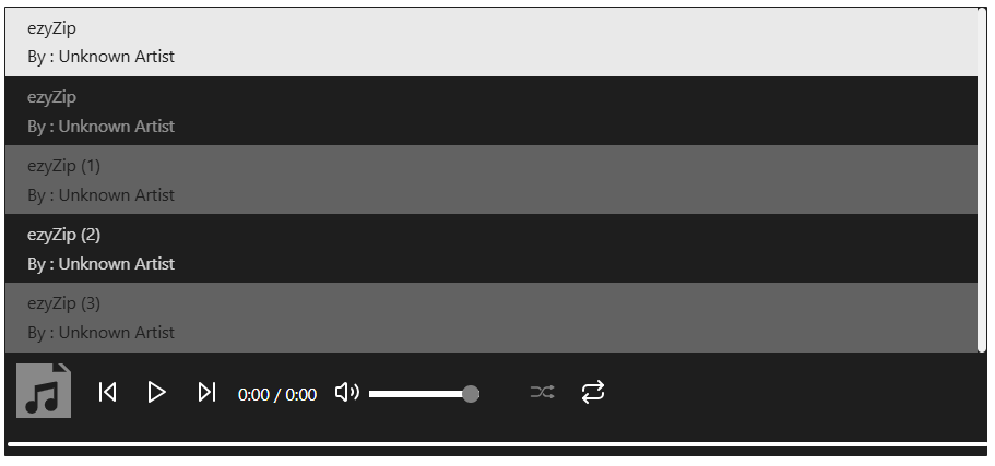
Music Player #
The Music Player Block enhances user experience by providing a customizable audio player that allows users to upload, manage, and play audio files effortlessly. This feature improves engagement by offering a seamless way to listen to music or audio content while browsing the site.
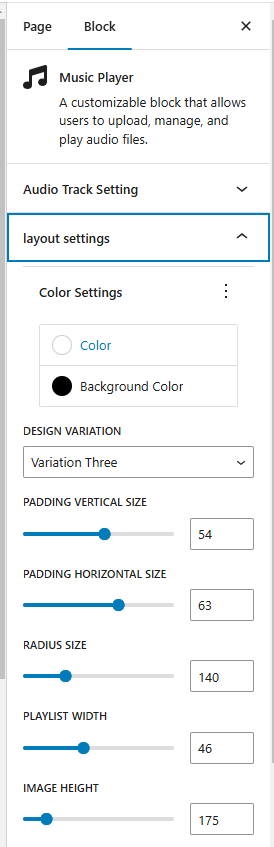
Music Player Options:
- Audio Track Settings:
- Attach Player at the Bottom – Option to enable or disable.
- Add Tracks – Easily add and manage tracks in a playlist.
- Layout & Design Settings:
- Color Customization – Select custom colors for text, icons, and controls.
- Background Color – Choose a background color for the player.
- Design Variations – Three unique styles to choose from:
- Variation 1
- Variation 2
- Variation 3
- Spacing & Sizing Options:
- Padding (Vertical & Horizontal) – Adjustable for better spacing.
- Border Radius – Customize the player’s roundness.
- Playlist Width – Define the width of the playlist area.
- Cover Image Height – Set and optimize cover image height for a visually appealing layout.
Frontend View of the Map Block:
Slider #
The Slider Block is a dynamic and customizable tool for creating visually engaging sliders. Perfect for displaying images, testimonials, trip highlights, or other content, it enhances user interaction while maintaining a clean and modern design.

- Auto Play: Enable/Disable slides transition automatically.
- Show Dots: Display navigation dots at the bottom of the slider for quick navigation between slides.
- Show Arrow: Enable left/right navigation arrows for manual slide control.
- Number of slides: Specify the total number of slides to include in the slider.
- Slide Per page: Define how many slides appear simultaneously on the screen.
Frontend View of the

Social Share #
The Social Site Block adds social media share buttons to your site, allowing users to easily share your content across popular platforms. This block enhances user engagement and helps increase the visibility of your content.
Social Share Options:

- Icon Settings:
- Icon Color: Customize the color of the social media icons.
- Text Color: Set the color for any accompanying text with the icons.
- Background Color: Choose the background color for each icon button.
- Border Color: Define the color of the icon borders.
- Icon Size: Adjust the size of each icon to fit your design.
- Font Size: Set the size of any text accompanying the icons.
- Border Size: Specify the thickness of the icon border.
- Border Radius Size: Adjust the roundness of the icon borders for a softer or more square appearance.
- Social Settings:
- Enable Facebook: Enable or disable Facebook.
- Enable Twitter: Enable or disable Twitter.
- Enable Gmail: Enable or disable Gmail.
- Enable Whatsapp: Enable or disable Whatsapp.
- Enable LinkedIn: Enable or disable LinkedIn.
- Enable Reddit: Enable or disable Reedit.
- Enable Tumblr: Enable or disable Tumblr.
- Enable Diigo: Enable or disable Diigo.
- Enable Pinterest: Enable or disable Pinterest.
- Enable Viber: Enable or disable Viber.
- Enable Snapchat: Enable or disable Snapchat.
Frontend View of the Social Share Block:

Rating Star #
This block allows you to display a set of rating stars, which can be used to show user reviews or ratings for a trip or service.
Rating Stars Options:

- Number of stars: This option allows you to define the total number of stars in the rating. Typically, this is set to 5 stars, but you can customize it based on your preferences.
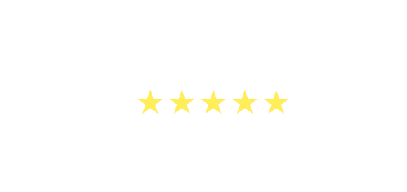
Frontend View of the Rating Stars Block:
Loader #
The Loader Block provides a dynamic visual indicator that enhances the user experience by showing a loading animation or progress indicator while content or elements are being loaded. This feature is ideal for improving user engagement during slow-loading pages or processes.
Loader Options:

- Choose Loader: Select the loader style that best suits your site’s needs.
- Inward Spiral
- Rotating Element
- Dots
- Letter
- Eye Animation
- Spinner
- Arcade
- Color Settings:
- Loader Background Color: Set the background color for the loading animation area.
- Loader Color: Customize the color of the animation itself.
- Loader Size: Adjust the size of the animation to fit your design needs.
- Border Radius: Modify the border radius to create rounded or sharp edges for the loader container.
- Page Load Time (In Seconds): Define the duration the loader should appear before the content is displayed.
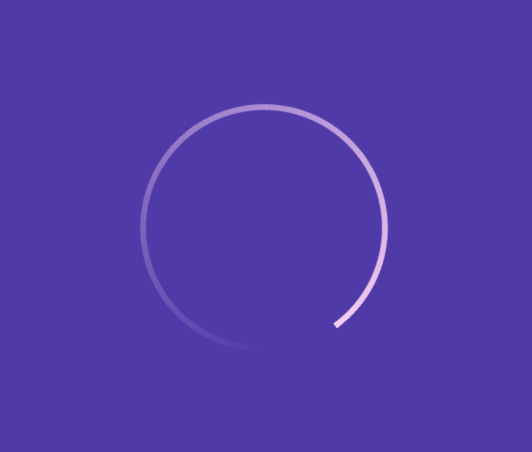
Frontend View of the Loader Block:
Timeline #
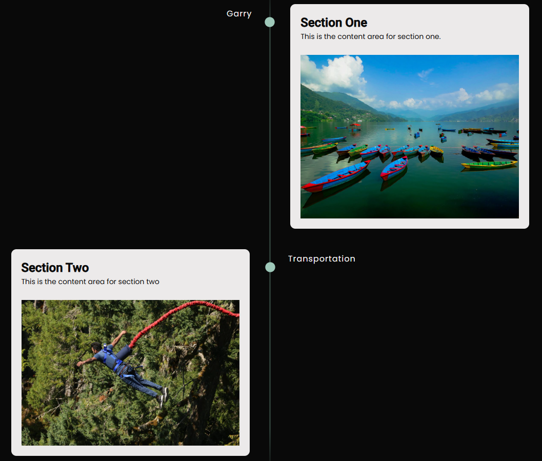
The Timeline Block is a versatile content element designed to visually represent chronological events, steps, or milestones in a linear or vertical format. It’s ideal for showcasing trip itineraries, company history, project phases, or any sequence-based content.
Timeline Options:
- Timeline Settings:
- Number of Timeline Items: Define how many items (steps or events) to include in the timeline.
- Item 1 Label: Customize the label for the first item.
- Item 2 Label: Customize the label for the second item.
- Timeline Styles:
- Color settings:
- Label Color: Choose the text color for the timeline item labels.
- Middle Line Color: Set the color for the central line that connects the items.
- Icon Color: Customize the color of the icons/dots used for each timeline item.
- Label Top Gap: Adjust the vertical space above each label for better layout control.
- Font Size: Set the size of the label and description text.
- Font Style:
- Normal:
- Italic:
- Font Weight:
- Thin
- Extra light
- Light
- Normal
- Medium
- semi Bold
- Bold
- Extra Bold
- Black
- Text Transform:
- None:
- Uppercase:
- Lowercase:
- capitalize
- Letter Spacing: Fine-tune the spacing between letters to improve readability and aesthetics.
- Color settings:
Frontend View of the Timeline Block
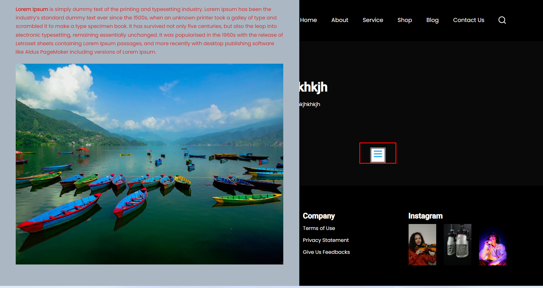
Sidebar Slide #
The Sidebar Slide block enables a sleek, interactive sidebar panel that slides into view when users hover near the edge of the screen. It enhances navigation, accessibility, and engagement—perfect for quick links, contact forms, social icons, or promotions.
Sidebar Slide Options:
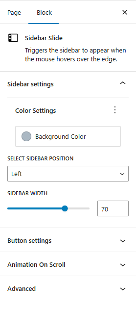
- Sidebar Settings
- Background Color: Customize the background color of the sidebar for visual consistency with your site.
- Sidebar Position: Choose where the sidebar appears:
- Left
- Right
- Sidebar Width: Define the sidebar’s width to suit your layout needs (e.g., 250px, 20%).
- Button Settings
- Show Icon: Toggle to display or hide an icon inside the button.
- Icon Type: Select the icon style (e.g., hamburger menu, arrow, info icon).
- Font Size: Set the icon or button text size.
- Color & Style Settings
- Text Color: Customize the color of the button text or icon.
- Border Color: Set the color of the button’s border.
- Background Color: Define the background color for the trigger button.
- Border Size: Adjust the thickness of the button border.
- Border Radius: Set the roundness of the button’s corners (e.g., 0 for square, 50px for fully rounded).
- Padding (Vertical): Add spacing above and below the button’s content.
- Padding (Horizontal): Add spacing to the left and right inside the button.
Frontend View of the Sidebar Slide Block:
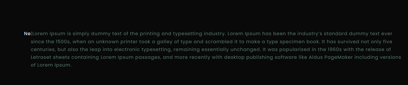
Typewriter #
The Typewriter Block animates text to simulate a typewriter effect—typing, pausing, deleting, and repeating a series of phrases. This dynamic block is perfect for hero sections, taglines, marketing headlines, or any place where you want to grab user attention with rotating messages.
Typewriter Options:
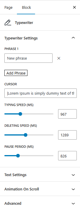
- Typewriter Settings
- Phrase 1: Enter the first phrase to display.
- Add Phrase: Add as many additional phrases as you’d like. The block will cycle through them in order.
- Cursor: Enable or customize the blinking cursor at the end of the typed text.
- Typing Speed (ms): Set how fast each letter appears (e.g., 100ms for fast typing, 200ms for slower).
- Deleting Speed (ms): Define how quickly each letter is deleted during backspacing.
- Pause Period (ms): Set how long the text stays on the screen before deleting starts.
- Text Settings
- Text Color: Set the color of the typed text.
- Cursor Color: Customize the color of the blinking cursor.
- Font Size: Define the size of the typewriter text (e.g., 24px).
- Font Style:
- Normal
- Italic
- Font Weight:
- Thin
- Extra Light
- Light
- Normal
- Medium
- Semi Bold
- Bold
- Extra Bold
- Black
- Letter Spacing: Adjust the spacing between each character for a tighter or more spaced look.
- Text Decoration:
- None
- Underline
- Overline
- Line-through
- Text Transform:
- None
- Uppercase
- Lowercase
- Capitalize
Frontend View of the Typewriter Block:
Video Popup #
The Video Popup Block provides a clean and interactive way to showcase videos on your site by displaying them in a lightbox-style popup. This feature is ideal for attracting attention to promotional content, tutorials, or featured video content.
Video Popup Options:
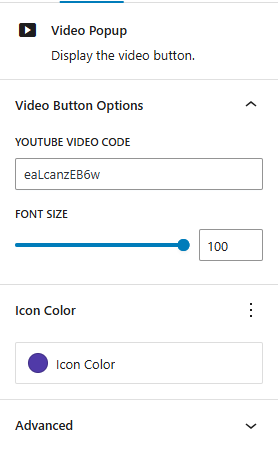
- Youtube Video code: Enter the unique YouTube video code to embed the video directly in the popup. This code is the part of the URL after
https://www.youtube.com/watch?v=, making it easy to add YouTube videos by pasting only the video ID. - Font Size: Define the font size for any text within the popup, such as titles or captions.
- Icon Color: Customize the color of the play button or icon used to trigger the popup, helping it stand out on your page.
Frontend View of the Video Popup Block:


